


Exploring Innovative Data Visualization Techniques
Understandinnovative data visualization techniques that make complex data insights easy to , helping businesses make informed decisions.
In the age of information overload, the ability to extract meaningful insights from vast datasets has become a crucial skill. Data visualization serves as the bridge between raw data and actionable insights, transforming complex information into visually digestible and compelling narratives. As we delve into the realm of innovative data visualization techniques, we embark on a journey to uncover new dimensions in the way we perceive and interpret data.
The Evolution of Data Visualization
The evolution of data visualization is a fascinating journey that spans centuries but has gained unprecedented momentum in the 21st century. In its earliest forms, data visualization manifested as maps and basic charts, serving as essential tools for conveying information. As societies progressed, the demand for more sophisticated representations of complex data arose, leading to the development of charts like bar graphs and pie charts. However, with the advent of the digital age, the sheer volume and intricacy of data exploded, necessitating a paradigm shift in visualization techniques.
Traditional static charts began to give way to interactive visualizations, marking a significant departure from the one-size-fits-all approach. This shift empowered users to engage dynamically with the data, explore specific data points, and tailor their analyses to suit their needs. The rise of interactive visualization tools, such as Tableau and D3.js, has democratized data exploration, making it accessible to a broader audience and fostering a more intuitive understanding of complex datasets.
Moreover, the integration of augmented and virtual reality has pushed the boundaries even further. Augmented reality overlays data onto the real world, while virtual reality creates immersive environments for data exploration. These technologies offer a transformative experience, allowing users to step into the data, manipulate variables in real-time, and gain insights in ways previously unimaginable.
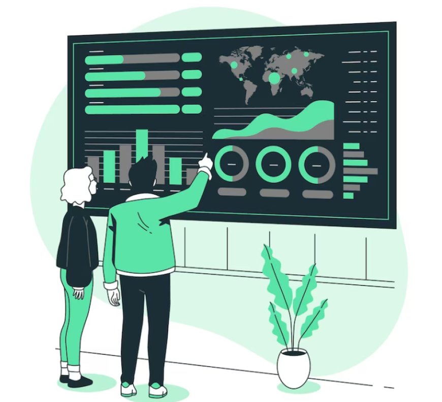
Interactive Visualizations
Interactive visualizations represent a transformative shift in the field of data visualization, transcending the limitations of static charts and graphs. Unlike traditional visualizations, which offer a fixed perspective, interactive visualizations empower users to actively engage with the data. This dynamic approach allows for a more personalized and immersive exploration of complex datasets.
Tools such as Tableau, D3.js, and Plotly have become instrumental in creating interactive dashboards that facilitate a hands-on experience. Users can navigate through the data, zoom in on specific data points, filter information based on their preferences, and dynamically adjust variables. This level of interactivity not only enhances the user experience but also enables a deeper understanding of the underlying patterns within the data.
Whether for business analytics, scientific research, or storytelling, interactive visualizations provide a powerful means of uncovering insights, fostering a more intuitive and collaborative approach to data exploration. The rise of interactive visualizations reflects a paradigm shift in how we perceive and interact with data, making it a cornerstone in the era of data-driven decision-making.
Augmented and Virtual Reality
In the ever-evolving landscape of technology, Augmented Reality (AR) and Virtual Reality (VR) have emerged as transformative forces, redefining our interactions with the digital and physical worlds. Augmented Reality enhances our real-world environment by overlaying digital information onto it, creating a blended, augmented experience. On the other hand, Virtual Reality immerses users in entirely virtual environments, shutting out the physical world to provide a simulated reality.
-
Augmented Reality (AR): Enhancing the Real World
Augmented Reality enriches our perception of the real world by superimposing digital elements onto our physical surroundings. This technology is often experienced through devices like smartphones, tablets, or AR glasses. For example, AR applications can provide real-time information about landmarks when you point your phone's camera at them or overlay directions onto the street as you navigate. In industries like healthcare, AR is used for medical training, where practitioners can visualize internal anatomy in real time during surgery.
-
Virtual Reality (VR): Immersing in Alternate Realities
Contrary to AR, Virtual Reality transports users to entirely computer-generated environments, blocking out the external world. VR is commonly experienced through headsets that encompass the user's field of vision. This technology has found applications in various fields, including gaming, education, and professional training. VR provides a simulated environment where users can interact with the surroundings in a way that feels remarkably real. In education, VR can facilitate virtual field trips, enabling students to explore historical sites or dive into the depths of the ocean without leaving the classroom.
-
Applications Across Industries
The impact of AR and VR extends across a multitude of industries. In healthcare, surgeons use AR to visualize patient data during procedures, while VR is employed for exposure therapy in mental health treatments. In retail, AR enhances the shopping experience by allowing customers to try on clothes or visualize furniture in their homes. Industries such as real estate utilize VR to offer virtual property tours, providing potential buyers with immersive walkthroughs from the comfort of their homes.
Storytelling with Data
Storytelling with Data is a powerful approach to data visualization that focuses on using visualizations to tell a compelling and coherent narrative, making data more accessible, understandable, and actionable for a wider audience. Here are some key aspects and explanations related to storytelling with data:
-
Narrative Structure: Storytelling with data involves structuring your data presentation like a story. It typically follows a narrative arc, starting with an introduction or context-setting, followed by a development of the plot (data exploration and analysis), a climax (key insights or findings), and a resolution (actionable takeaways or recommendations).
-
Audience-Centric: Effective storytelling with data considers the needs and interests of the audience. You tailor your narrative and visualizations to resonate with your target audience's background, knowledge level, and goals. This approach ensures that your data story is relevant and engaging to your audience.
-
Simplicity: Storytelling with data emphasizes simplicity and clarity in visualizations. Complex data is distilled into straightforward charts, graphs, or infographics, avoiding unnecessary jargon and complexity. The goal is to make the data as accessible as possible.
-
Emphasis on Context: A key aspect of storytelling with data is providing context. You explain why the data matters, what problem it addresses, and what implications the findings have. Contextualization helps the audience connect with the data and understand its significance.
-
Engaging Visuals: Visualizations play a central role in storytelling with data. They should be visually appealing, easy to interpret, and aligned with the narrative. Charts and graphs are chosen based on the type of data and the message you want to convey. For example, bar charts, line graphs, and pie charts are common choices, but more innovative visuals may also be used when appropriate.
Machine Learning-driven Visualizations
Machine Learning-driven Visualizations represent a fascinating intersection of two powerful fields: machine learning and data visualization. In this approach, machine learning techniques are employed to not only analyze and derive insights from large and complex datasets but also to generate visual representations of the data that make patterns and trends more accessible and understandable to humans. Here's a deeper explanation of the topic:
-
Data Analysis and Feature Extraction: In machine learning-driven visualizations, sophisticated machine learning algorithms are utilized to process and analyze datasets. These algorithms can perform tasks such as classification, regression, clustering, or anomaly detection, depending on the specific goals of the project. During this analysis, important features or patterns within the data are extracted, often in high-dimensional spaces that are challenging for humans to comprehend directly.
-
Visualization Generation: Once the machine learning model has processed the data and extracted relevant information, the next step is to generate visual representations. These visualizations can take various forms, such as scatter plots, heat maps, line charts, bar graphs, or even complex multidimensional visualizations. The choice of visualization type depends on the nature of the data and the insights the model aims to convey.
-
Interpretable Visualizations: Machine learning-driven visualizations are designed with interpretability in mind. They should provide clear and intuitive representations of complex data relationships, making it easier for analysts, domain experts, or decision-makers to understand and act upon the information. These visualizations often include labels, color coding, and annotations to enhance comprehension.
-
Pattern Discovery: Machine learning models can uncover hidden patterns, correlations, and anomalies in the data that might not be apparent through traditional statistical analysis or manual exploration. Visualizations help reveal these patterns by presenting them in a visual format, allowing users to identify trends and outliers quickly.
Geospatial Visualization
Geospatial visualization is a dynamic field that involves the representation of data in a geographic context, often employing maps and spatial analysis tools. This technique allows individuals and organizations to explore and understand data patterns, relationships, and trends across geographical locations. In geospatial visualization, datasets are linked to specific geographic locations, enabling a visual depiction of information on maps. This approach is particularly powerful for gaining insights into spatial relationships, distribution of resources, and identifying patterns that may be hidden in traditional tabular data.
Geospatial visualization is applied across various domains, including urban planning, environmental science, public health, business intelligence, and disaster management. By overlaying data onto maps, analysts and decision-makers can discern spatial correlations and make informed decisions. For example, in urban planning, geospatial visualization can reveal trends in population density, transportation patterns, and land use, aiding in the development of sustainable and efficient urban environments.
Moreover, advancements in Geographic Information System (GIS) technology have elevated geospatial visualization capabilities. GIS tools enable the integration of diverse datasets, such as satellite imagery, demographic information, and environmental data, creating comprehensive maps that offer a holistic understanding of a given area. This integration is invaluable in scenarios like disaster response, where quick and accurate visualization of affected regions helps coordinate relief efforts.
Ethical Considerations in Data Visualization
Geospatial visualization involves the representation and analysis of data in a geographic context, providing a visual depiction of information on maps or spatial layouts. This technique leverages Geographic Information System (GIS) tools to transform complex datasets into meaningful insights tied to specific locations. By mapping data onto geographical spaces, geospatial visualization allows for a deeper understanding of spatial relationships, patterns, and trends. This approach is crucial in various fields, including urban planning, environmental science, epidemiology, and business intelligence. Geospatial visualization enables decision-makers to make informed choices by visually interpreting data in the context of its geographic distribution, fostering a more comprehensive and location-aware perspective on the information at hand.
In the era of big data, mastering innovative data visualization techniques is no longer a luxury but a necessity. The evolving landscape of visualization tools and technologies is reshaping how we interact with data, fostering a deeper understanding and facilitating more informed decision-making. As we continue to push the boundaries of what is possible in data visualization, the key lies in finding the delicate balance between aesthetics, functionality, and ethical considerations to unleash the full potential of visual storytelling in the data-driven age.