


Foundations of Data Analytics
Learn the foundations of data analytics: types, tools, SQL, Python, visualization, and learning path. Includes India & USA career & salary data for 2026.

Every app you use, every purchase you make, every search you run, is all data. And somewhere, someone is studying it to make a smarter decision.
That is data analytics in its simplest form. Not reserved for mathematicians or computer scientists. Not something you need a postgraduate degree to understand. It is a practical skill that helps people in every industry, healthcare, retail, finance, manufacturing, and education, understand what is actually happening in their business and act on it.
This guide starts from the very beginning. By the end, you will understand what data analytics is, how it works, which tools professionals use, what the career opportunities look like in India and globally, and exactly how to start learning it with a realistic timeline and real code you can run yourself.
What Is Data Analytics?
Data analytics is the process of examining raw data to find patterns, draw conclusions, and support better decisions.
Think of it like detective work. You gather clues (data), look for connections (patterns), and reach a conclusion (insight) that helps solve a real problem. The hospital uses it to understand which patients are at higher risk of complications before symptoms worsen. The retail chain uses it to stock the right products before a holiday rather than after. The bank uses it to flag a fraudulent transaction before the customer even notices it.
Data analytics is not one single thing; it is a combination of methods, tools, and thinking skills that work together. Understanding the foundations means understanding each of these components and how they connect.
The Four Types of Data Analytics
Every analytics question falls into one of four categories. Knowing which type you are dealing with determines which techniques and tools you need.
1. Descriptive Analytics: What Happened?
Descriptive analytics summarizes historical data to understand past events. It is the most common type of analytics in day-to-day business: the monthly sales report, the customer satisfaction dashboard, and the year-over-year revenue comparison.
Real example: An e-commerce company runs a report showing that sales in March 2026 were ₹4.2 crore, down 12% from February. That is descriptive analytics. It tells you what happened, stated as a fact.
Tools: Excel, SQL, Power BI, Tableau. Most dashboards you encounter in business are descriptive analytics.
2. Diagnostic Analytics: Why Did It Happen?
Diagnostic analytics investigates the reasons behind a result. Once you know sales dropped 12%, diagnostic analytics asks why and follows the data to find out.
Real example: Drilling into the March data, the analyst finds that mobile checkout conversion dropped from 4.2% to 1.9% after a website update on March 3. The drop was not a market problem it was a UX problem introduced by a specific code change.
Tools: SQL for slicing data, cohort analysis, funnel analysis, correlation analysis.
3. Predictive Analytics: What Will Happen?
Predictive analytics uses historical patterns and statistical models to forecast future outcomes.
Real example: A bank trains a model on 3 years of loan repayment data. The model identifies that customers with income-to-debt ratios below 2.5, fewer than 18 months at their current employer, and two or more previous missed payments have a 73% probability of defaulting within 6 months. The bank uses this score to adjust its lending criteria.
Tools: Python (scikit-learn), R, machine learning algorithms, statistical modeling.
4. Prescriptive Analytics: What Should We Do?
Prescriptive analytics goes beyond prediction — it recommends specific actions to achieve a desired outcome.
Real example: A supermarket's prescriptive system does not just forecast that demand for bottled water will spike 40% before a heatwave. It automatically adjusts purchase orders with three supplier variants, reprioritizes warehouse picking sequences, and updates shelf replenishment schedules, all without a human decision at each step.
Tools: Optimization algorithms, ML models combined with decision rules, reinforcement learning.
Most organizations in 2026 operate primarily at levels 1 and 2, with growing investment in predictive and prescriptive capabilities as data infrastructure matures.
Where Does Data Come From?
Before you can analyze anything, you need data. In practice, data comes from more sources than most beginners expect:
Transactional systems generate records every time a sale, payment, booking, or return occurs. These are often the cleanest, most structured datasets an analyst works with.
Web and app activity captures every click, page view, search term, and session duration, generating enormous volumes of behavioral data that reveal how users actually interact with products.
CRM and ERP systems hold customer relationship data, order histories, and operational records across sales, finance, and supply chain.
Social media and reviews provide unstructured text data, opinions, complaints, and sentiment that require different techniques (NLP) to analyze.
IoT sensors and machines generate real-time streams of numerical data from physical devices, temperature sensors in a factory, GPS from delivery vehicles, and wearables in clinical trials.
Surveys and interviews provide direct qualitative input from customers or employees, often coded into categories for quantitative analysis.
Data generally falls into two categories. Structured data is organized in rows and columns like a database table or spreadsheet. Unstructured data is free-form, like customer reviews, audio recordings, or social media posts. Structured data is where most beginner analysts start. Unstructured data requires more advanced tools and techniques.
Data Preprocessing: The Work Nobody Talks About
Here is what the highlight reels of data analytics consistently skip over: most of the actual work is cleaning and preparing data before any real analysis begins.
A 2024 Anaconda survey of over 3,000 data practitioners found that 45% of working time is spent on data preparation, more than any other activity. Raw data is messy. It has missing values, duplicate records, inconsistent formats, and outliers that can throw off your entire analysis.
Preprocessing is the process of fixing all of this before your analysis touches the data.
Common preprocessing tasks include:
Handling missing values. A customer record with no email address, a transaction with no product category, a sensor reading that went offline for an hour. You need a decision for each: fill it in (imputation), remove the record, or flag it separately.
Removing duplicates. The same order appears twice in the database because of a system sync error. Left uncleaned, your revenue figures will be overstated.
Standardizing formats. Dates stored as "2026-01-15" in one system and "15 Jan 2026" in another. Customer names in all caps in one table and proper case in another. Inconsistent formats break joins and produce silent errors.
Identifying and handling outliers. A single transaction showing ₹99,00,000 in a dataset where the 99th percentile is ₹15,000 is either a data entry error or a genuinely exceptional event. Either way, it needs investigation before it distorts your average.
Preprocessing in Python
python
import pandas as pd
import numpy as np
# Load a sample sales dataset
df = pd.read_csv('sales_data.csv')
# Step 1: Check the shape and basic info
print(f"Dataset: {df.shape[0]} rows, {df.shape[1]} columns")
print(df.info())
# Step 2: Check for missing values
missing = df.isnull().sum()
missing_pct = (missing / len(df) * 100).round(2)
print("\nMissing values:")
print(pd.DataFrame({'Count': missing, 'Percent': missing_pct})[missing > 0])
# Step 3: Remove duplicate rows
duplicates_before = df.duplicated().sum()
df = df.drop_duplicates()
print(f"\nRemoved {duplicates_before} duplicate rows")
# Step 4: Fill missing numeric values with median
numeric_cols = df.select_dtypes(include=[np.number]).columns
df[numeric_cols] = df[numeric_cols].fillna(df[numeric_cols].median())
# Step 5: Standardize a date column
df['order_date'] = pd.to_datetime(df['order_date'], errors='coerce')
# Step 6: Identify outliers using IQR method
Q1 = df['revenue'].quantile(0.25)
Q3 = df['revenue'].quantile(0.75)
IQR = Q3 - Q1
lower_bound = Q1 - 1.5 * IQR
upper_bound = Q3 + 1.5 * IQR
outliers = df[(df['revenue'] < lower_bound) | (df['revenue'] > upper_bound)]
print(f"\nOutliers detected in revenue: {len(outliers)} rows")
print(f"Revenue range after IQR: ₹{lower_bound:,.0f} – ₹{upper_bound:,.0f}")
print("\nDataset after preprocessing:", df.shape)
Skipping preprocessing is how you end up with confident-looking charts built on unreliable data. Clean data is not glamorous, but it is the foundation on which everything else depends.
Exploratory Data Analysis (EDA)
Before building dashboards or predictive models, experienced analysts spend time simply exploring the data. This phase, called Exploratory Data Analysis or EDA, is where you learn what you are actually working with.
The goal of EDA is to understand the structure of your dataset, what variables exist, how they are distributed, whether there are obvious patterns, and what questions are worth investigating further.
EDA often changes the direction of an analysis entirely. You go in expecting to study one thing and find something far more interesting in the data.
EDA in Python
python
import pandas as pd
import matplotlib.pyplot as plt
import seaborn as sns
df = pd.read_csv('sales_data.csv')
# ── UNIVARIATE ANALYSIS ──────────────────────────────────
# Distribution of revenue
plt.figure(figsize=(10, 4))
plt.subplot(1, 2, 1)
df['revenue'].hist(bins=30, edgecolor='black', color='steelblue')
plt.title('Revenue Distribution')
plt.xlabel('Revenue (₹)')
plt.ylabel('Frequency')
# Box plot to spot outliers
plt.subplot(1, 2, 2)
df.boxplot(column='revenue', vert=True)
plt.title('Revenue Box Plot')
plt.tight_layout()
plt.show()
# ── SUMMARY STATISTICS ───────────────────────────────────
print("Revenue Summary:")
print(df['revenue'].describe().round(2))
print(f"\nMedian revenue: ₹{df['revenue'].median():,.0f}")
print(f"Skewness: {df['revenue'].skew():.2f}")
# ── BIVARIATE ANALYSIS ───────────────────────────────────
# Relationship between discount and revenue
plt.figure(figsize=(8, 5))
plt.scatter(df['discount_pct'], df['revenue'],
alpha=0.4, color='coral')
plt.xlabel('Discount (%)')
plt.ylabel('Revenue (₹)')
plt.title('Discount vs Revenue')
plt.show()
print(f"\nCorrelation (discount vs revenue): "
f"{df['discount_pct'].corr(df['revenue']):.3f}")
# ── CATEGORICAL ANALYSIS ─────────────────────────────────
# Revenue by product category
category_revenue = df.groupby('category')['revenue'].sum().sort_values()
category_revenue.plot(kind='barh', color='teal', figsize=(8, 4))
plt.title('Total Revenue by Product Category')
plt.xlabel('Total Revenue (₹)')
plt.tight_layout()
plt.show()
Common EDA findings that change analysis direction: a variable you assumed was continuous is actually ordinal. A category you expected to be your strongest performer is actually your weakest in profitability (not revenue). Two variables you assumed were independent turned out to be 0.87 correlated.
EDA is what separates analysts who ask smart questions from those who just build the dashboard they were asked for.
Statistical Foundations for Data Analytics
You do not need a statistics degree to work in data analytics. You do need to understand the key concepts well enough to apply them correctly and interpret the results honestly.
Descriptive Statistics: Summarizing What You Have
Descriptive statistics describe the data you have collected. They tell you what your dataset looks like at a glance.
Measures of central tendency describe the "typical" value:
-
Mean: The average. Sensitive to outliers, one extremely large value pulls it up significantly.
-
Median: The middle value when sorted. Robust to outliers, often a more honest representation of "typical" for skewed data like salaries or house prices.
-
Mode: The most frequently occurring value. Useful for categorical data.
Measures of spread describe how varied the data is:
-
Range: Maximum minus minimum. Simple but heavily influenced by extreme values.
-
Variance: The average squared deviation from the mean.
-
Standard deviation: The square root of variance in the same units as the original data, making it interpretable. A low standard deviation means values cluster tightly around the mean. A high standard deviation means they are spread widely.
Inferential Statistics: Concluding Beyond Your Sample
Inferential statistics let you draw conclusions about a larger population based on a sample. This is how a survey of 1,000 customers can tell you something meaningful about a million-person customer base.
Hypothesis testing is the process of checking whether a pattern in your data is real or just a result of random chance.
Example: You changed the color of a checkout button from grey to blue. The conversion rate in the test group is 3.8% versus 3.2% in the control group. Is this difference real, or could it have happened by chance even if the button color makes no difference? A hypothesis test gives you a quantitative answer.
p-value: The probability that your observed result could have occurred by chance if there were no real effect. A p-value below 0.05 (5%) is the conventional threshold for calling a result "statistically significant", meaning you are 95% confident it is not random noise.
Confidence intervals: Rather than a single estimate ("the mean order value is ₹2,340"), a confidence interval gives you a range ("we are 95% confident the true mean order value is between ₹2,180 and ₹2,500"). It communicates uncertainty honestly, which is what good analysts do.
SQL for Quick Statistical Queries
sql
-- Summary statistics for order values
SELECT
COUNT(*) AS total_orders,
ROUND(AVG(order_value), 2) AS mean_value,
ROUND(STDDEV(order_value), 2) AS std_deviation,
MIN(order_value) AS min_value,
PERCENTILE_CONT(0.25) WITHIN GROUP
(ORDER BY order_value) AS percentile_25,
PERCENTILE_CONT(0.50) WITHIN GROUP
(ORDER BY order_value) AS median_value,
PERCENTILE_CONT(0.75) WITHIN GROUP
(ORDER BY order_value) AS percentile_75,
MAX(order_value) AS max_value
FROM orders
WHERE order_date >= '2026-01-01';
SQL: The Most Important Technical Skill in Data Analytics
If you learn one technical skill for data analytics, make it SQL. It appears in more job descriptions than any other tool, including Python.
SQL (Structured Query Language) is how you communicate with databases. Every company stores its operational data in databases, including customer records, transactions, product catalogues, and usage logs. SQL is how you get that data out and start analyzing it.
Core SQL for Analytics
sql
-- ── BASIC RETRIEVAL ──────────────────────────────────────
SELECT
customer_id,
order_date,
product_category,
order_value,
region
FROM orders
WHERE order_date >= '2026-01-01'
AND order_value > 500
ORDER BY order_date DESC;
-- ── AGGREGATION AND GROUPING ─────────────────────────────
-- Monthly revenue by region
SELECT
region,
DATE_TRUNC('month', order_date) AS month,
COUNT(*) AS total_orders,
ROUND(SUM(order_value), 0) AS total_revenue,
ROUND(AVG(order_value), 2) AS avg_order_value
FROM orders
WHERE order_date >= '2026-01-01'
GROUP BY region, DATE_TRUNC('month', order_date)
ORDER BY month, total_revenue DESC;
-- ── JOINING TABLES ───────────────────────────────────────
-- Combine orders with customer information
SELECT
c.customer_name,
c.city,
c.acquisition_channel,
COUNT(o.order_id) AS total_orders,
ROUND(SUM(o.order_value), 0) AS lifetime_value,
MAX(o.order_date) AS last_order_date
FROM customers c
LEFT JOIN orders o ON c.customer_id = o.customer_id
GROUP BY c.customer_id, c.customer_name, c.city, c.acquisition_channel
ORDER BY lifetime_value DESC;
-- ── WINDOW FUNCTIONS ─────────────────────────────────────
-- Running total and rank within region
SELECT
region,
month,
total_revenue,
SUM(total_revenue) OVER (
PARTITION BY region
ORDER BY month
ROWS BETWEEN UNBOUNDED PRECEDING AND CURRENT ROW
) AS running_total,
RANK() OVER (
PARTITION BY month
ORDER BY total_revenue DESC
) AS revenue_rank
FROM monthly_revenue_by_region;
Learning path for SQL: Start with SELECT and WHERE (week 1), then JOINs (week 2), then GROUP BY and aggregation (week 3), then subqueries and CTEs (week 4), then window functions (weeks 5–6). At that point, you can handle 90% of analytical queries.
Data Visualization: Making Data Communicate
Numbers in a spreadsheet rarely move people to act. A clear, well-designed chart often does.
Data visualization is the practice of representing data graphically so patterns become easier to see and communicate. The right visual makes a complex finding immediately obvious. The wrong one hides the truth or actively misleads.
Choosing the Right Chart
The most common visualization mistake is choosing a chart based on aesthetics rather than what the data is saying.
A bar chart compares values across categories, such as which product sells the most, which region performs best.
A line chart shows change over time in revenue by month and user growth by week. Never use a bar chart for trends.
A scatter plot reveals the relationship between two numerical variables: does customer tenure correlate with order frequency?
A histogram shows the distribution of a single numerical variable. How are order values distributed across the range?
A box plot shows median, spread, and outliers simultaneously and allows comparison across groups.
A heatmap shows magnitude across two dimensions simultaneously, for example, sales by product and by month.
Python Visualization
python
import pandas as pd
import matplotlib.pyplot as plt
import seaborn as sns
# Set clean visual style
sns.set_theme(style="whitegrid", palette="muted")
df = pd.read_csv('sales_data.csv')
fig, axes = plt.subplots(2, 2, figsize=(14, 10))
fig.suptitle('Sales Performance Dashboard', fontsize=16, fontweight='bold')
# 1. Monthly revenue trend (line chart)
monthly = df.groupby('month')['revenue'].sum().reset_index()
axes[0, 0].plot(monthly['month'], monthly['revenue'],
marker='o', linewidth=2, color='steelblue')
axes[0, 0].set_title('Monthly Revenue Trend')
axes[0, 0].set_xlabel('Month')
axes[0, 0].set_ylabel('Revenue (₹)')
axes[0, 0].tick_params(axis='x', rotation=45)
# 2. Revenue by category (horizontal bar)
cat_rev = df.groupby('category')['revenue'].sum().sort_values()
axes[0, 1].barh(cat_rev.index, cat_rev.values, color='teal')
axes[0, 1].set_title('Revenue by Category')
axes[0, 1].set_xlabel('Total Revenue (₹)')
# 3. Order value distribution (histogram)
axes[1, 0].hist(df['order_value'], bins=40,
color='coral', edgecolor='white')
axes[1, 0].set_title('Order Value Distribution')
axes[1, 0].set_xlabel('Order Value (₹)')
axes[1, 0].set_ylabel('Frequency')
# 4. Discount vs Revenue (scatter plot)
axes[1, 1].scatter(df['discount_pct'], df['revenue'],
alpha=0.3, color='purple', s=20)
axes[1, 1].set_title('Discount % vs Revenue')
axes[1, 1].set_xlabel('Discount (%)')
axes[1, 1].set_ylabel('Revenue (₹)')
plt.tight_layout()
plt.savefig('sales_dashboard.png', dpi=150, bbox_inches='tight')
plt.show()
Visualization Tools for Analytics Professionals
Microsoft Excel remains the starting point for most analytics work. Pivot tables, XLOOKUP, and Power Query handle most entry-level analytical tasks. Every analytics role assumes Excel fluency.
Power BI is Microsoft's enterprise BI platform deeply integrated with the Microsoft ecosystem, widely adopted in Indian enterprises, BFSI, and IT services sectors. If your target employers use Microsoft infrastructure, Power BI is the right BI tool to learn first.
Tableau offers more sophisticated visual control and broad enterprise adoption globally. Appears frequently in analytics job postings in India and internationally. A strong second choice if your target companies are product or consulting firms.
Google Looker Studio (formerly Data Studio) is free, cloud-based, and excellent for sharing reports with non-technical stakeholders. Well-suited for marketing and digital analytics contexts.
Python (Matplotlib and Seaborn) enable custom, reproducible visualizations that go beyond what BI tools offer, particularly important for statistical analysis, EDA outputs, and model evaluation.
Practical recommendation: Learn Excel first (2–4 weeks), then Power BI or Tableau (4–6 weeks), then add Python visualization as you progress. Do not try to learn all of them simultaneously.
Essential Data Analytics Tools in 2026
The tools you use depend on your role and the problems you are solving. Here is the practical stack that most analytics professionals actually use, with an honest assessment of each:
Excel is your first stop for a reason. It handles most entry-level and many mid-level analytics tasks: pivot tables, XLOOKUP, charts, Power Query for data transformation, and scenario modeling. Nearly every analytics role — from junior analyst to analytics manager — expects Excel fluency. Do not skip this because it seems basic.
SQL is the language of data. If company data lives in a database (and it almost always does), SQL is how you access it. Start with SELECT, WHERE, JOIN, and GROUP BY. Add window functions and CTEs as you advance. SQL proficiency is the single skill most correlated with landing an analytics job.
Power BI or Tableau, pick one first. Power BI integrates naturally in Microsoft environments (common in Indian enterprises, BFSI, and IT services). Tableau offers more visual flexibility and appears frequently in consulting and product companies. Both appear constantly on analytics job postings.
Python with the Pandas, NumPy, and Matplotlib/Seaborn libraries expands what is possible beyond Excel and SQL. Handle large datasets that Excel cannot, build reproducible analysis workflows, and transition toward machine learning. Python becomes essential once you move beyond descriptive analysis.
Learning order: Excel → SQL → Power BI or Tableau → Python. Depth in this core stack produces better outcomes than surface familiarity with a dozen tools.
Machine Learning in Data Analytics: Where the Two Connect
As your data analytics skills develop, you will encounter problems that statistical analysis alone cannot solve efficiently, such as predicting which customers will churn next month, which loan applications will default, and which products a specific user is most likely to buy. This is where machine learning enters the analytics workflow.
Machine learning is not a separate discipline from analytics it is the predictive layer that sits on top of the analytical foundation you are building.

The Three Core ML Approaches in Analytics
Supervised Learning trains a model on historical data with known outcomes — then uses the learned patterns to predict outcomes for new data.
Business example: A telecom company has 3 years of customer data, including usage patterns, payment history, and whether each customer churned or stayed. A supervised learning model trains on this data and learns which patterns predict churn. Deployed on the current customer base, it scores every customer with a churn probability, enabling the retention team to focus outreach on the 5% most likely to leave.
Unsupervised Learning finds structure in data without being told what to look for.
Business example: A retail bank has 800,000 customers it wants to understand better. Without predefined segments, a clustering algorithm identifies five distinct customer groups based on financial behavior: high earners with low engagement, young credit builders, risk-averse savers, business banking users, and high-balance low-activity accounts. Each group receives a different product offer and communication strategy.
Reinforcement Learning trains agents to make sequential decisions by rewarding good outcomes and penalizing bad ones, particularly relevant for recommendation systems, pricing optimization, and logistics.
A Simple ML Model in Python
python
import pandas as pd
from sklearn.model_selection import train_test_split
from sklearn.ensemble import RandomForestClassifier
from sklearn.metrics import (classification_report,
roc_auc_score)
import matplotlib.pyplot as plt
# Load customer data
df = pd.read_csv('customer_data.csv')
# Define features and target
features = ['tenure_months', 'monthly_charges',
'support_calls_last_90d', 'usage_score',
'payment_delay_count']
X = df[features]
y = df['churned'] # 1 = churned, 0 = stayed
# Split into training (80%) and test (20%) sets
X_train, X_test, y_train, y_test = train_test_split(
X, y, test_size=0.2, random_state=42, stratify=y
)
# Train a Random Forest classifier
model = RandomForestClassifier(
n_estimators=100,
max_depth=6,
random_state=42
)
model.fit(X_train, y_train)
# Evaluate
y_pred = model.predict(X_test)
y_prob = model.predict_proba(X_test)[:, 1]
print("Model Performance:")
print(classification_report(y_test, y_pred,
target_names=['Stayed', 'Churned']))
print(f"AUC-ROC Score: {roc_auc_score(y_test, y_prob):.3f}")
# Feature importance — which factors drive churn most?
importance = pd.Series(model.feature_importances_,
index=features).sort_values()
importance.plot(kind='barh', title='Feature Importance for Churn',
color='steelblue', figsize=(8, 4))
plt.xlabel('Importance Score')
plt.tight_layout()
plt.show()
You do not need to understand how Random Forest works mathematically to run this analysis. You do need to understand what the output means: precision, recall, AUC-ROC and whether the model is good enough for a real business decision. That evaluation judgment is the analytics skill.
Career Paths in Data Analytics
Understanding the career landscape helps you choose the right learning path and certification.
Roles at the Data Analytics Intersection
Data Analyst: The most accessible entry point. Works with SQL, Excel, and BI tools to produce reports, dashboards, and descriptive insights. Closest to business stakeholders. Primary output: dashboards, reports, ad hoc analysis.
Business Analytics Specialist: Combines analytical skills with business domain knowledge to answer strategic business questions. Works across functions: marketing, operations, finance, HR.
Analytics Engineer: Builds and maintains the data models that power dashboards and reports. Heavy SQL and dbt work. Sits between data engineering and analytics. Growing rapidly in 2026.
Data Scientist: Builds predictive models and runs experiments. Requires stronger Python, statistics, and machine learning skills than a data analyst role.
BI Developer / Report Developer: Specializes in building enterprise reporting systems and dashboards in Power BI or Tableau. More technical than a data analyst, more tool-focused than a data scientist.
India Salary Data (2026)
|
Role |
Experience |
Annual Salary (India) |
|
Junior Data Analyst |
0–1 year |
₹3.5 – ₹6.5 LPA |
|
Data Analyst |
1–3 years |
₹6 – ₹12 LPA |
|
Senior Data Analyst |
3–5 years |
₹12 – ₹20 LPA |
|
Analytics Engineer |
2–5 years |
₹10 – ₹22 LPA |
|
Business Analytics Specialist |
2–5 years |
₹8 – ₹18 LPA |
|
Analytics Manager |
5–8 years |
₹18 – ₹35 LPA |
|
Head of Analytics |
8+ years |
₹35 – ₹65 LPA |
City-Wise Salary for Data Analysts in India
|
City |
Junior (0–2 yr) |
Senior (3–5 yr) |
|
Bangalore |
₹5 – ₹9 LPA |
₹14 – ₹22 LPA |
|
Mumbai |
₹4.5 – ₹8 LPA |
₹12 – ₹20 LPA |
|
Hyderabad |
₹4 – ₹7 LPA |
₹11 – ₹18 LPA |
|
Pune |
₹4 – ₹7 LPA |
₹10 – ₹17 LPA |
|
Delhi / NCR |
₹4.5 – ₹8 LPA |
₹11 – ₹19 LPA |
|
Chennai |
₹3.5 – ₹6.5 LPA |
₹10 – ₹16 LPA |
USA Salary Data (2026)
|
Role |
Entry-Level |
Mid-Level |
Senior |
|
Data Analyst |
$65K – $85K |
$90K – $120K |
$125K – $160K |
|
Analytics Engineer |
$90K – $115K |
$115K – $145K |
$145K – $185K |
|
Business Analytics Manager |
$110K – $135K |
$135K – $170K |
$170K – $210K |
Full data analyst salary guide for India
Building a Data-Driven Mindset
Technical skills get you into analytics. But the professionals who build long-term careers in this field share something more important than tool proficiency: a specific way of thinking about problems.
Ask "compared to what?" before accepting any number. Revenue of ₹4.2 crore in March means nothing in isolation. Is that up or down from February? From March last year? From plan? Every metric needs a reference point to be interpretable.
Distinguish between correlation and causation. Sales and ice cream consumption both rise in summer. They are correlated, but neither causes the other — both are driven by heat. Acting on a correlation as if it were causation leads to expensive, ineffective interventions.
Communicate uncertainty, not false precision. Saying "revenue will be exactly ₹4.8 crore in Q2" is almost certainly wrong. Saying "our model projects Q2 revenue between ₹4.4 and ₹5.2 crore at 80% confidence" is honest and useful.
Ask the right question before building the analysis. The most common analytics failure is answering a well-defined wrong question. Spend time with stakeholders before touching data — understand the decision they are trying to make, not just the metric they asked for.
Be the analyst who simplifies, not the one who impresses. Charts with five variables, Y-axes that start at 79%, and dashboards that require three minutes of explanation to read are signs of an analyst optimizing for appearance. The best analysts strip complexity away until the insight is visible to anyone.
How to Start Learning Data Analytics: A Practical Roadmap
This is an honest, specific path, not a list of resources you will never finish.
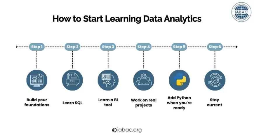
Month 1–2: Excel and Statistics Foundations
Start with Excel. Not because it is exciting, but because it is universal, every analytical role you will ever interview for assumes you can use it. Work through pivot tables, VLOOKUP, Power Query, and basic charting on real datasets (Kaggle has many free ones).
Alongside Excel, study foundational statistics. Khan Academy's Statistics and Probability course is excellent and free. Focus on mean, median, standard deviation, probability, and hypothesis testing. You do not need mathematical derivations; you need to understand what each concept means and when to apply it.
Goal: By the end of month 2, you should be able to load a dataset in Excel, summarize it with pivot tables, build three or four charts that tell a coherent story, and explain what a p-value means in plain English.
Month 2–4: SQL
SQL is the single most important technical skill in analytics. Every data analyst role tests it in interviews. Start with MODE Analytics, SQLZoo, or W3Schools for free practice. Progress from SELECT and WHERE through JOINs, GROUP BY, and subqueries. Then tackle window functions.
Goal: By the end of month 4, you should be able to write a query that joins two tables, aggregates data by category and time period, calculates a running total, and ranks records within groups. That covers 90% of real analytics SQL.
Month 4–6: Power BI or Tableau
Pick one. Power BI if your target employers are enterprises, BFSI, or IT services companies. Tableau if you are targeting analytics consulting, product companies, or international markets.
Microsoft Learn offers free, structured Power BI training. Tableau has its own free learning platform. Work through a real dataset build a dashboard that tracks revenue, customer acquisition, and operational performance in a single view.
Goal: By the end of month 6, you should be able to connect a dataset to your BI tool, build a multi-page dashboard with filters and drill-downs, and present your findings to a non-technical audience.
Month 6–9: Python
Python expands everything. Start with Pandas for data manipulation, then NumPy for calculations, then Matplotlib and Seaborn for visualization. DataCamp and Coursera both have structured Python paths for data work.
Do not try to learn Python in the abstract; pick a project and use Python to do it. Take the same dataset you analyzed in Excel, replicate the analysis in Python, and add something Python can do that Excel cannot (larger dataset, more complex transformation, reproducible output).
Goal: By the end of month 9, you should be able to load, clean, and analyze a dataset with 1M+ rows in Python, produce publication-quality charts, and write scripts that can be rerun on new data automatically.
Month 9–12: Projects, Certification, and Job Preparation
Build two to three portfolio projects using public datasets from Kaggle, data.gov, or Hugging Face. Each project should start with a genuine business question, document your methodology and decisions clearly, and end with a concrete recommendation, not just a chart.
Pursue a recognized certification to formally validate your skills. IABAC's Certified Data Analyst (CDA) program provides a structured assessment recognized by employers across India and globally.
Practice SQL and Python in interview conditions, timed, without reference material. The gap between "I know SQL" and "I can write this query confidently in 10 minutes under pressure" is where most candidates lose analytics interviews.
Goal: By month 12, you should have two to three documented projects, a recognized certification, and the ability to pass a standard analytics technical interview.
Full data analytics scope and career paths
Is data science a good career in 2026?
Certifications That Validate Your Data Analytics Skills
Completing projects and learning tools builds skills. A recognized certification validates those skills to employers a meaningful distinction in a competitive job market.
IABAC offers data analytics certifications designed for professionals at every stage:
Certified Data Analyst (CDA) covers SQL, Python, data visualization, statistical analysis, and business problem framing. Competency-based assessment with employer verification through iabac.org. Designed for professionals at the 3–6 month stage of their analytics learning journey.
Business Analytics Foundation is the entry point for complete beginners — structured coverage of data concepts, Excel analytics, and basic BI tools.
Certified Business Analytics Expert (CBAE) is the advanced credential for professionals ready to move into senior analytics roles.
Data Analytics for Managers is designed specifically for business professionals who need to interpret and challenge analytics outputs rather than produce them.
Explore all data analytics certifications
Business analytics certification guide
Frequently Asked Questions
What are the foundations of data analytics?
The foundations of data analytics are: the four types of analytics (descriptive, diagnostic, predictive, prescriptive), data sources and data types, data preprocessing and cleaning, exploratory data analysis, descriptive and inferential statistics, data visualization, and the core tools (SQL, Excel, Python, Power BI or Tableau). Building competency across all six areas gives you the foundation for any analytics role.
Can I learn data analytics without a mathematics degree?
Yes. Most analytics work requires practical statistical concepts such as mean, median, standard deviation, hypothesis testing, and confidence intervals, not advanced mathematics. These are learnable through structured courses without a formal maths background. Excel and SQL, the most-used analytics tools, require no mathematical background at all.
How long does it take to learn data analytics from scratch?
With consistent study of 10–12 hours per week, most beginners reach a job-ready level within 9–12 months. The practical milestones: Excel and basic statistics in 2 months, SQL in 4 months, a BI tool in 6 months, Python basics in 9 months. The final 3 months focus on projects and interview preparation.
Which skill should I learn first, SQL, Python, or Excel?
Excel first, then SQL. Excel is faster to learn and immediately useful for understanding data structure and analysis. SQL is the most important single skill for analytics hiring; start it by month 2. Python comes after you have SQL fluency, usually around month 6. Do not start with Python before SQL.
Is data analytics a good career in India in 2026?
Yes. India added over 1 million data-related jobs in 2024 alone (NASSCOM 2025). Data analyst and business analytics roles are among the fastest-growing job categories globally through 2030 (WEF Future of Jobs Report 2025). Entry-level data analysts in India earn ₹3.5–6.5 LPA. Senior analysts earn ₹12–22 LPA. Analytics managers earn ₹18–35 LPA.
What is the difference between data analytics and data science?
Data analytics focuses on analyzing existing data to describe what happened, diagnose why, and forecast what will happen using SQL, BI tools, and statistics. Data science focuses on building predictive models and ML systems requiring stronger Python, mathematics, and ML framework skills. Analytics is more accessible and often more directly tied to business decisions. Data science has a higher technical ceiling and typically higher compensation at senior levels.
Do I need coding skills for data analytics?
SQL is essential; it is not optional for most analytics roles. Python is important for mid-level and senior roles but is not typically required at the entry level. Excel requires no coding. BI tools like Power BI and Tableau are mostly drag-and-drop with some formula writing. The practical minimum: SQL fluency + Excel proficiency + one BI tool = entry-level ready.
What are the best free resources to learn data analytics?
SQL: SQLZoo, MODE Analytics SQL Tutorial, W3Schools SQL. Statistics: Khan Academy Statistics and Probability. Power BI: Microsoft Learn free training. Python for data: Google's Python for Data Analysis course on Coursera (free audit), DataCamp free tier. Practice datasets: Kaggle, UCI Machine Learning Repository, data.gov.
Conclusion
Data analytics is one of the most accessible, practically valuable, and career-relevant skills available to anyone willing to invest consistent effort over 9–12 months.
The foundations are not complex in isolation: the four types of analytics, how data is collected and cleaned, how to explore and visualize it, how statistics make findings trustworthy, and how tools like SQL and Python make the work efficient. What makes analytics genuinely difficult is not any one concept but the integration of all of them using the right technique, on clean data, with an honest interpretation, communicated clearly to someone who needs to act on it.
That integration is what experience builds. And experience starts with the first SQL query, the first pivot table, the first EDA on a real dataset.
Start with Excel. Run your first SQL query. Build one dashboard. The analysts making real impact today are not necessarily those with the most sophisticated tools they are the ones who ask better questions, interpret findings honestly, and communicate clearly.
The field rewards curiosity and consistency more than credentials. But the right certification, when paired with genuine skills and a documented portfolio, opens doors that would otherwise stay closed.