


What Are Data Visualization Fundamentals?
Learn what data visualization fundamentals are and how charts, graphs & dashboards help turn complex numbers into simple insights for better understanding.
Data visualization fundamentals help people turn numbers into charts, graphs, and visual images that are easier to understand. Instead of reading long tables of numbers, you can quickly see patterns, trends, and comparisons through visuals.
For example, a simple bar chart can show which product sells the most. A line graph can show how sales changed over time. These visuals help people make faster and better decisions.
I’ll explain data visualization fundamentals in simple terms. If you are new to data or planning to build a career in analytics, understanding these basics will help you work with data more effectively.
Understanding Data Visualization
Data visualization means presenting data in a visual format such as charts, graphs, maps, or dashboards.
The goal is to make complex information easier to understand. Humans process visual information much faster than text or numbers. When data is shown visually, it becomes easier to spot trends and insights.
For example:
-
A line chart can show how website traffic changes every month.
-
A pie chart can show the percentage of customers from different regions.
-
A bar chart can compare sales performance between products.
Instead of reading hundreds of rows in a spreadsheet, a visual chart can explain the same information in seconds.
This is why data visualization is widely used in business, marketing, finance, healthcare, and many other fields.
Why Data Visualization Is Important
Data visualization is important because it helps people understand information quickly and clearly.
Here are a few key reasons why organizations rely on data visualization.
Faster Understanding
Large datasets can be overwhelming. Visual charts simplify information and allow people to understand it quickly.
Better Decision Making
When data is presented visually, managers and teams can identify patterns and trends easily. This helps them make better decisions.
Clear Communication
Not everyone is comfortable reading technical data reports. Visual charts help explain information to a wider audience, including non-technical teams.
Identifying Trends and Patterns
Visualization helps highlight patterns that may not be obvious in raw data. For example, a sudden drop in sales or a steady growth trend becomes visible in a line chart.
Making Data Engaging
People are more likely to engage with visual content than plain numbers. Dashboards and charts make reports more interesting and interactive.
Key Elements of Data Visualization Fundamentals
To create effective visuals, it is important to understand the core elements of data visualization.
Data
Data is the foundation of every visualization. It can come from different sources such as databases, surveys, business systems, or online platforms.
Before creating a visualization, the data should be clean, accurate, and well organized.
Charts and Graphs
Charts and graphs are the main tools used to represent data visually.
Different types of charts serve different purposes. Choosing the right chart helps the audience understand the data more clearly.
Labels and Titles
Clear titles and labels are essential in any visualization. They explain what the chart represents and help viewers interpret the information correctly.
Without proper labels, even a good chart can become confusing.
Colors and Design
Colors help highlight important information and make visuals more attractive.
However, too many colors can create confusion. Good visualization focuses on clarity and simplicity.
Context
Data visuals should always provide context. Viewers should understand what the numbers represent and why the information matters.
Adding brief explanations or notes can help provide that context.
Common Types of Data Visualization
Different charts are used depending on the type of data and the story you want to tell.
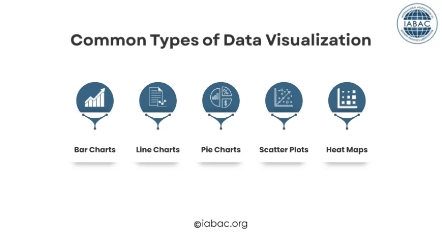
Here are some of the most commonly used visualizations.
Bar Charts
Bar charts are one of the simplest and most popular ways to compare values.
They are useful for showing differences between categories, such as product sales, customer segments, or revenue by region.
Line Charts
Line charts are used to show trends over time.
For example, they can display website traffic growth, monthly sales performance, or stock price movement.
Pie Charts
Pie charts show proportions or percentages.
They are often used to represent how a whole is divided into smaller parts.
Scatter Plots
Scatter plots show relationships between two variables.
They are helpful when analyzing patterns such as the relationship between advertising spend and sales.
Heat Maps
Heat maps use colors to represent the intensity of values. They are often used in website analytics or geographic data analysis.
Data Visualization vs Data Analysis
Many beginners assume that data visualization and data analysis are the same. However, they serve different purposes.
Data analysis involves examining data to find patterns, relationships, and insights. Analysts study datasets using various techniques to understand what the data reveals.
Data visualization focuses on presenting those insights visually. After analyzing the data, charts and dashboards help communicate the findings in a clear and simple way.
In simple terms, data analysis discovers insights, while data visualization helps share those insights effectively.
Popular Data Visualization Tools
Today, several tools help professionals turn raw data into clear charts and dashboards. These tools make it easier to analyze information and present insights visually.
Microsoft Excel is one of the most widely used tools for data visualization. It allows users to quickly create charts such as bar graphs, line charts, and pie charts, making it a great starting point for beginners.
Another powerful visualization tool is Tableau. It is widely used by organizations to create interactive dashboards and explore large datasets.
Power BI is also popular in many businesses. It helps teams build dynamic dashboards and share insights across departments.
For beginners and smaller teams, Google Data Studio provides an easy way to create visual reports using data from different online sources.
These tools make it easier for individuals and organizations to transform raw data into meaningful visual insights.
Principles of Good Data Visualization
Not all charts are effective. Poor visualization can confuse viewers instead of helping them understand the data.
Here are some important principles to follow.
Keep It Simple
Avoid adding unnecessary elements to charts. Too many labels, colors, or graphics can distract from the main message.
Simple visuals are usually more powerful.
Choose the Right Chart
Different data types require different visual formats.
For example:
-
Use bar charts for comparisons
-
Use line charts for trends
-
Use pie charts for proportions
Choosing the correct chart improves clarity.
Focus on the Story
Every visualization should communicate a clear message.
Before creating a chart, ask yourself: What insight do I want the audience to understand?
The design should support that message.
Use Consistent Colors
Consistent color usage helps viewers understand charts quickly.
For example, if blue represents one product in a chart, it should represent the same product in other charts as well.
Highlight Important Insights
Important data points should stand out.
This can be done using color, annotations, or labels to guide the viewer’s attention.
Real-World Examples of Data Visualization
Data visualization is used in many industries today.
Business
Companies use dashboards to monitor sales performance, customer behavior, and financial metrics.
Marketing
Marketing teams analyze campaign performance, website traffic, and social media engagement through visual reports.
Healthcare
Hospitals use visual data to track patient statistics, disease patterns, and treatment outcomes.
Finance
Financial analysts use charts to track investments, market trends, and company performance.
Government
Governments use visual data to present economic statistics, population data, and public policy outcomes.
These examples show how visualization helps people understand complex information quickly.
Common Mistakes to Avoid in Data Visualization
Even experienced analysts sometimes make mistakes while creating visual reports.
Here are a few common ones to avoid.
Overloading Charts with Information
Too much information can overwhelm viewers. It is better to break complex data into multiple simple charts.
Using the Wrong Chart Type
Using a pie chart when a bar chart would work better can make the data harder to understand.
Ignoring the Audience
Different audiences require different levels of detail. A technical report may include more data, while a business presentation should focus on key insights.
Poor Color Choices
Using too many colors or colors that are hard to distinguish can reduce clarity.
The Growing Demand for Data Visualization Skills
As organizations collect more data, the demand for people who can understand and present data visually is increasing.
Companies need professionals who can turn complex data into meaningful insights that guide decision-making.
Skills in data visualization are valuable for roles such as:
-
Business analysts
-
Data scientists
-
Marketing analysts
-
Business intelligence professionals
Learning these fundamentals can open doors to many career opportunities in the data field.
How Beginners Can Start Learning Data Visualization
If you are new to this field, starting with the fundamentals is the best approach.
Here are a few simple steps to begin learning:
-
Understand basic chart types and when to use them
-
Practice creating charts using sample datasets
-
Study real dashboards used by businesses
-
Learn how to communicate insights clearly
-
Continue practicing with different data scenarios
The more you work with data, the easier it becomes to identify patterns and present them effectively.
Data visualization fundamentals help transform raw numbers into meaningful visuals that people can easily understand. Instead of reading long spreadsheets, charts and graphs allow us to quickly see patterns, comparisons, and trends.
By learning the basics of charts, design principles, and storytelling with data, anyone can improve how they analyze and communicate information. As businesses continue to rely on data-driven decisions, visualization skills are becoming increasingly valuable across industries.
For learners who want to build deeper expertise in this area, pursuing a Visual Analytics Certification from IABAC can help strengthen practical knowledge and career opportunities in the field of data analytics.