


What Are the Best Data Visualization Tools in 2026?
Confused by spreadsheets? Find out the best data visualization tools of 2026, honest comparisons, free vs paid picks, and how to choose the right one.

You open a spreadsheet. 5,000 rows are staring back at you. You scroll up, scroll down, squint at the numbers, and still have no clear idea what the data is actually saying.
Sound familiar?
This is the everyday reality for thousands of people working with data. And it is exactly the problem data visualization tools were built to solve. Instead of digging through endless rows and columns, you get a clean chart, a live dashboard, or an interactive report that tells the story at a glance.
Let's break it down: the right tool is out there, and by the end of this, you will know exactly which one fits your work.
What Exactly Are Data Visualization Tools?
Simply put, data visualization tools are software platforms that convert raw data into visual formats, such as bar charts, pie charts, heat maps, line graphs, scatter plots, and interactive dashboards.
Instead of reading numbers, you see patterns. Instead of writing long reports, you share one clear dashboard. Instead of guessing what the data is saying, the visual tells you instantly.
They are used across industries from healthcare and finance to e-commerce and education by everyone from solo freelancers to Fortune 500 companies.
The Market Is Growing Fast. Here Is Why That Matters
Here is a number worth paying attention to:
The global data visualization tools market is projected to grow from USD 13.71 billion in 2026 to USD 34.07 billion by 2034, at a CAGR of 12.05%.
That is not just a stat for investors. It tells you that businesses everywhere are doubling down on visualization because it genuinely works. Companies are realizing that data presented visually leads to faster decisions, fewer mistakes, and better alignment across teams.
If you have been putting off learning or adopting a visualization tool, now is a good time to start.
The Top Data Visualization Tools in 2026
There is no single "best" tool for everyone. The right choice depends on your skill level, budget, and what you actually need it for. Here is an honest breakdown:
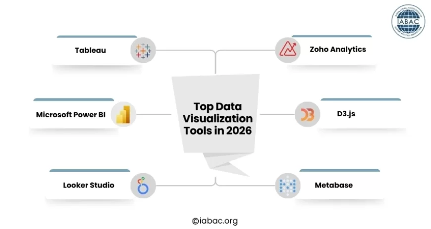
1. Tableau
Tableau is one of the most recognized names in this space. It connects to hundreds of data sources, handles massive datasets, and creates stunning, interactive dashboards with a drag-and-drop interface.
-
Best for: Large enterprises, data analysts, and teams with complex reporting needs.
-
Strength: Deep analytics, 200+ native data connectors, advanced statistical features
-
Honest downside: It has a steep learning curve. If you are brand new to data, walking into Tableau can feel like sitting in a graduate-level class without a syllabus.
2. Microsoft Power BI
Power BI is the go-to choice for businesses already working within the Microsoft ecosystem. It integrates seamlessly with Excel, Azure, and Teams, making the transition very smooth for existing Microsoft users.
-
Best for: Microsoft-heavy organizations, business analysts, and mid-sized teams.
-
Strength: Affordable, strong data modeling, natural language queries, 1,000+ custom visuals via AppSource.
-
Honest downside: Some advanced features require knowledge of DAX (a formula language), which takes time to learn.
3. Looker Studio (formerly Google Data Studio)
Looker Studio is completely free and works exceptionally well if your data already lives in Google products such as Google Analytics, Google Ads, Google Sheets, and so on.
-
Best for: Marketers, small teams, freelancers, and anyone in the Google ecosystem.
-
Strength: 100% free, easy to use, great for web and marketing analytics.
-
Honest downside: Limited customization compared to Tableau or Power BI; can slow down with large datasets.
4. Zoho Analytics
Zoho Analytics is an underrated option that packs a lot of punch for its price. It offers a clean interface, connects to 500+ data sources, and includes a conversational analytics feature where you can ask questions in plain language and get instant charts in return.
-
Best for: Small to medium businesses, startups, and teams wanting affordability with solid features.
-
Strength: Easy to set up, strong free tier, great for non-technical users.
-
Honest downside: Not as robust as Tableau for highly complex, multi-layered analytics.
5. D3.js
D3.js is not a drag-and-drop platform. It is a JavaScript library that gives developers complete control over how data is visualized inside web applications.
-
Best for: Developers and engineers who need custom, highly specific visualizations.
-
Strength: Limitless flexibility and customization; if you can imagine it, you can build it.
-
Honest downside: You need to write code. It is not suitable for non-technical users at all.
6. Metabase
Metabase is an open-source tool that strikes a nice balance between simplicity and depth. The community edition is completely free, making it a popular pick for startups and lean teams.
-
Best for: Small teams, startups, and organizations on tight budgets.
-
Strength: Intuitive interface, simple dashboard creation, no technical expertise needed for everyday use.
-
Honest downside: Limited advanced features compared to enterprise-grade tools.
What Features Should You Look for in a Data Visualization Tool in 2026?
Modern data visualization tools do far more than create charts and dashboards. As data volumes grow and reporting needs become more complex, choosing the right platform often comes down to the features it offers beyond visualization.
AI-Assisted Analytics
Many tools now help users identify patterns, detect anomalies, and recommend visualizations automatically, reducing the time required to explore large datasets.
Natural Language Querying
Some platforms allow users to ask questions in plain language and receive charts or reports instantly, making data analysis more accessible to non-technical teams.
Real-Time Reporting
Organizations that track live business metrics, such as sales performance, inventory levels, or marketing campaigns, should look for tools that support real-time data refreshes and monitoring.
Self-Service Analytics
The best platforms enable business users to create reports and explore data independently, reducing reliance on data teams for routine reporting requests.
Integration and Scalability
As businesses grow, data often comes from multiple sources. A strong visualization tool should connect easily with databases, cloud platforms, business applications, and third-party services while handling increasing data volumes efficiently.
Free vs. Paid: What Is the Real Difference?
This is one of the most common questions people ask, and the answer is more nuanced than a simple yes or no.
Free tools work well when:
-
You are just starting and testing workflows
-
Your team is small, and your data is relatively straightforward
-
Your data already lives in Google or similar free platforms
-
You only need basic charts and standard reports
Paid tools make more sense when:
-
You need real-time data refreshes and live dashboards.
-
You are pulling from multiple data sources simultaneously.
-
You need collaboration features, user access controls, and version history.
-
You are building dashboards for external clients or senior stakeholders.
-
Security, compliance, and enterprise-level support matter to your organization.
One thing to watch out for: hidden costs. Connector fees, per-seat pricing, and storage limits can quietly raise your monthly bill as your team grows. Always test a tool with your least technical team member first; if they struggle, the whole team will.
The Most Common Mistakes People Make When Choosing a Tool
Most people pick the wrong tool not because they made a bad choice, but because they skipped a few important questions before deciding. Here is what to watch out for:
-
Choosing based on popularity, not fit. Tableau is powerful, but it may be overkill if all you need is a clean monthly sales chart.
-
Ignoring your team's actual skill level. A tool that nobody uses is worthless, regardless of how many features it has.
-
Skipping the free trial. Always test with your real data before committing to any paid plan.
-
Overlooking the total cost of ownership. Factor in training time, onboarding, and connector fees, not just the license price.
-
Picking a tool designed for the wrong job. A developer building a live web dashboard should not be wrestling with a drag-and-drop marketing report builder.
How to Choose the Right Tool: A Simple Framework
Before committing to any platform, answer these four questions honestly:
-
Who will use it? Non-technical users need simplicity. Developers want flexibility. Analysts need depth and raw power.
-
Where does your data live? If it is in Google products, Looker Studio is the obvious starting point. If it spans multiple databases and business apps, you need a tool with strong integration options.
-
What is your budget? Free tools are genuinely useful, but scale your expectations accordingly. Paid tools earn their cost when your data complexity grows.
-
What will you actually build? Executive dashboards, embedded analytics in products, customer-facing reports, and real-time monitors all call for different tools.
When you have clear answers to these four questions, the right tool usually becomes obvious on its own.
One Honest Piece of Advice Before You Pick
Do not fall into the trap of chasing the most popular name. The best data visualization tool is the one that gets out of your way, meaning you stop thinking about the software and start thinking about what the data is telling you.
Start simple. Pick a tool you can actually use today. Build one dashboard. Share it with your team. Get feedback. Then grow from there.
The goal was never to have the fanciest tool. The goal is to make better decisions faster.
Frequently Asked Questions
Which tool is right for a complete beginner?
Start with Looker Studio or Zoho Analytics. Both are free or low-cost, have drag-and-drop interfaces, and do not require any coding knowledge. Once you are comfortable, you can step up to Power BI or Tableau as your needs grow.
Can I use these tools without knowing how to code?
Yes, absolutely. Tableau, Power BI, Looker Studio, Zoho Analytics, and Metabase are all built with non-technical users in mind. You can build professional-looking dashboards without writing a single line of code. Coding only becomes relevant if you choose developer-focused options like D3.js or Chart.js.
What is the difference between a visualization tool and a BI platform?
A visualization tool focuses on turning data into charts and dashboards. A Business Intelligence (BI) platform goes further: it includes data warehousing, ETL (data cleaning and transformation), reporting infrastructure, and governance features. Tools like Tableau and Power BI both cover visualization and BI end-to-end. Tools like Datawrapper or Flourish are purely visualization-focused, designed for publishing charts quickly.
What about real-time data visualization?
Not all tools handle live data equally. If your business needs to track things as they happen — live sales figures, server performance, or real-time campaign results — look specifically at tools built for it. Grafana is excellent for real-time technical monitoring. Power BI and Domo support streaming datasets and live dashboards built for business users.
Data visualization tools are no longer optional for anyone working with data — they are how modern decisions get made. From free options like Looker Studio to enterprise powerhouses like Tableau and Power BI, the right tool depends entirely on your needs, your team, and how complex your data really is.
Pursuing an IABAC Certified Data Analyst certification gives you the structured, industry-recognized foundation to master these tools professionally and turn data into real business decisions with confidence.