


What Is Visual Analytics and How It Works?
Learn Visual Analytics, Understand your data with simple visuals, see trends clearly, and make smarter choices in business, healthcare, and education.

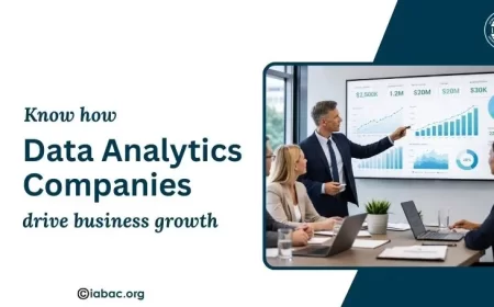
Visual analytics is the science of evaluating complex data using interactive visuals. It quickly reveals patterns, trends, and insights by combining data analysis, visualization, and user engagement. It is opposed to traditional spreadsheets, makes data understandable and useful. I'll tell you why this is important: when companies, healthcare providers, and educators have a visual understanding of their data, they can make better decisions more quickly.
Effective data exploration is made possible by programs like Tableau, Power BI, and Python libraries. Gaining proficiency is essential in today's data-driven environment since it improves analytical thinking, problem-solving, and decision-making.
What do you mean by visual analytics?
The study of data analysis through visual interfaces is known as visual analytics. Lets you view the data in graphical formats like maps, charts and dashboards, in contrast to traditional methods that only use numbers, formulae, or spreadsheets.
Imagine having thousands of sales data from the previous year. Analyzing raw data in a spreadsheet can be time-consuming and complex. However, trends and patterns are immediately apparent when you make a line chart or heat map. This is what it is all about: it turns complicated data into understandable visuals.
It's essential to remember that it includes more than just making eye-catching charts. It combines the following:
-
Data analysis: It is the process of taking raw data and turning it into useful knowledge.
-
Data visualization: It is the graphical representation of data.
-
User interaction: Allowing people to study and interact with data to gain knowledge.
Because of this combination, it is an effective tool for making decisions in government projects, healthcare, education, and business.
Why is it important?
Data is everywhere in the world. Studies show that every day, more than 2.5 quintillion bytes of data are generated. It is almost impossible to make sense of such large data volumes without the right tools. It solves this problem by providing:
1. Better decision-making
Decision-makers can spot patterns and trends that might have been unnoticed with the help of this. A company can use this information to help with strategic planning, for example, by determining which items are selling better in a given area.
2. Faster insights
It can take hours or even days to understand the numbers on a spreadsheet. The use of graphs, charts, and dashboards helps us to quickly understand findings.
3. Simplifies complex data
Many industries, like healthcare and banking, handle huge and complex databases. This data is simplified using it so that even non-experts can understand it easily.
4. Encourages collaboration
Teams may share visual dashboards, which makes it easier for everyone to work together on ideas and stay on the same page.
How does it work?
To help users understand data, it integrates visual representation with computer data analysis. Let's take it step by step:
1. Data Collection
Data collection is the first step. Multiple sources, including databases, online surveys, sensors, and social media platforms, may provide this data.
2. Data Preparation
Rarely is raw data clean. It might have duplicate entries, mistakes, or missing values. Data preparation is the process of cleaning, filtering, and organizing data so that it may be effectively evaluated.
3. Data Analysis
Analytical methods such as statistical analysis, machine learning algorithms, or predictive modeling are used once the data is prepared. This helps in locating relationships, patterns, and trends in the data.
The foundation of this. Visual representations such as line charts, bar graphs, heat maps, scatter plots, and dashboards are created from the processed data. The data is easier to understand due to these visuals.
5. User Interaction
The capacity for users to engage with the visuals is an important component of it. For example, you can drill down to view complete information, filter information by location, or zoom into certain data points. This interactive technique helps in the exploration of data from multiple perspectives.
6. Insight Generation
Finally, the visualizations provide users with insights. Decision-making, problem-solving, and trend forecasting are all helped by these insights.
Types of visual analytics
There is no standard approach to this. There are various techniques for it based on the type of data and goals:
1. Descriptive Analytics
This type answers the question: “What happened?”
It focuses on providing an overview by utilizing charts and graphs to summarize historical data. A sales report that displays revenue increase over the previous 12 months is an example of this.
2. Diagnostic Analytics
This type answers the question: “Why did it happen?”
It studies the data in more detail to determine the causes of trends or patterns. For example, it can be used to determine why sales declined in a specific area.
3. Predictive Analytics
This type answers the question: “What will happen?”
It predicts future events using machine learning and statistical algorithms. For example, predicting next month's stock prices or client demand.
4. Prescriptive Analytics
This type answers the question: “What should we do?”
It goes beyond predicting to make recommendations for strategies or actions based on insights from data. Prescriptive analytics can be used, for example, by a retail business to optimize inventory levels.
Tools used in visual analytics
This is now available to both beginners and specialists because of a variety of tools. Among the most commonly used tools are:

-
Tableau: This is well-known for its easy-to-use dashboards and impressive visualizations.
-
Power BI: This is Microsoft's solution for interactive reports and business intelligence.
-
QlikView: Provides flexible data exploration with a focus on user engagement.
-
D3.js: It is a JavaScript toolkit for creating highly customisable web-based visualizations.
-
Python libraries (Matplotlib, Seaborn, and Plotly): For more technically inclined users who prefer to code their visualizations.
Choosing the proper tool is determined by your skills, data complexity, and goals.
Applications of visual analytics
Many industries have practical uses for this. Here are a few examples:
1. Business and Marketing
This is used by businesses to monitor marketing efforts, track sales performance, and understand customer behaviour.
2. Healthcare
This is used by hospitals and research facilities to track disease outbreaks, monitor patient data, and improve treatment strategies.
3. Education
Visual dashboards are used by colleges and universities to monitor student involvement, attendance, and performance.
4. Government and Public Sector
This is used by governments to plan for disaster response, analyze the pattern of crime, and manage traffic.
5. Finance
This is used by banks and financial organizations for risk management, market trend analysis, and fraud detection.
Benefits of learning visual analytics
There are multiple benefits for professionals and students interested in this:
-
Better problem-solving skills: You gain the ability to make data-driven judgments and conduct efficient data analysis.
-
Career opportunities: In professions involving analytics, business intelligence, and data science, analytics abilities are highly valued.
-
Better data understanding: You learn how to translate complex data into simple visualizations.
-
Increased creativity: Creating meaningful visuals encourages creative thinking.
The area of this is fascinating because it connects data and understanding. It helps us to recognize trends, make choices more quickly, and effectively convey information. Gaining proficiency in this can help you advance your career, regardless of your background—student, professional, or someone interested in making decisions based on data.
If you are serious about learning and pursuing a career in this profession, the Visual Analytics Certification is an excellent opportunity to prove your abilities and receive industry recognition.